Creative Coding
Since I knew that we were going to touch certain elements of HTML and CSS for the first time, I made sure to start nice and simple. So I added the skeleton of the web-page as we were taught to do first.


As you can see I filled out general bits such as the website title for the head section. Cormac came up with a good title for our website; using our initials and the topic of our mission.
Lusine also came up with the clever idea of creating a logo to represent our group and display it as an icon on the browser window. Unfortunately, we ran out of time to get started on it, but it would have definitely made the website more unique as well as adding a level of professionalism to it.
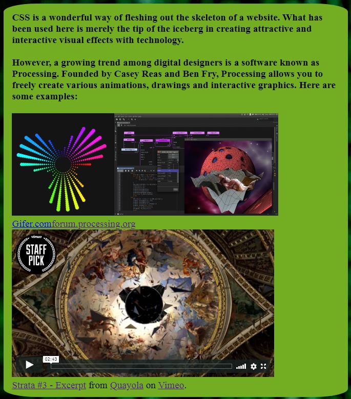
I added a <p> (paragraph) tag where I included a short summary about the more fun side of coding: CSS and animations. The paragraph is meant to give the class a small introduction to CSS as it was a foreign part of web design for many of us. I also talked a little bit about Processing, followed by a few examples showcasing the potential of using processing as a tool for visual designers. The examples include an embedded vimeo video, a gif and image. I'm not gonna lie, it got messy pretty quick... I'm sorry if you're reading this because it would probably be a messy endeavor to even make sense of what I am talking about 😂
Lusine also came up with the clever idea of creating a logo to represent our group and display it as an icon on the browser window. Unfortunately, we ran out of time to get started on it, but it would have definitely made the website more unique as well as adding a level of professionalism to it.
I added a <p> (paragraph) tag where I included a short summary about the more fun side of coding: CSS and animations. The paragraph is meant to give the class a small introduction to CSS as it was a foreign part of web design for many of us. I also talked a little bit about Processing, followed by a few examples showcasing the potential of using processing as a tool for visual designers. The examples include an embedded vimeo video, a gif and image. I'm not gonna lie, it got messy pretty quick... I'm sorry if you're reading this because it would probably be a messy endeavor to even make sense of what I am talking about 😂
Moving on... I knew I wanted to present the information in some form of text box, so I messed around with the examples on W3schools.com by changing, adding or removing values to have a text box that would match the theme of the site. The text box itself was made using CSS.

I then added an 'id' or 'class' to target the paragraph to the css that written for it.

This is the result I got for the text. I was quite satisfied with it.

The first image at the top right is a simple GIF, the image next to it shows how the interface looks like while using the processing software. Lastly, I included a wonderful piece of work made using Processing by Quayola. You'll find the video embedded in this post just below if you're interested in taking a peek!
Strata #3 - Excerpt from Quayola on Vimeo.
I soon realized that we weren't introduced to navigation bars just yet. I wasn't satisfied with just leaving the linked pages as a boring <ul> list element such as this:

This is the result I got for the text. I was quite satisfied with it.
The first image at the top right is a simple GIF, the image next to it shows how the interface looks like while using the processing software. Lastly, I included a wonderful piece of work made using Processing by Quayola. You'll find the video embedded in this post just below if you're interested in taking a peek!
Strata #3 - Excerpt from Quayola on Vimeo.
- Home
- Poem
- Gallery
So I decided to explore W3schools.com site to look for an alternative. I ended up taking down some notes that would help me better understand HTML and some of the terminology.
Eventually, I discovered a simpler way, by using the <button> tag at the top of the page as a navigation bar for our website.
Home
↓
 |
| Some progress made to make the website a little more pleasing to look at. |
Most of what I have mentioned so far has taken several attempts and equally a lot of time. The deadline was rolling in, and I soon realized that; I talked about processing but I haven't even gotten the chance to use it let alone learn how to use it. I knew I needed to add some form of animation so I can at least partially fulfill one part of our goal for this project.
Luckily, I borrowed and altered an existing animation from W3schools.com. I managed to turn the square in a circle, made sure it traveled around the entire page. I also changed the speed and duration and other elements of the animation. Most of the CSS terms are confusing and I wasn't too proud that I couldn't do more or create my own for that matter.
Nonetheless, I carried on adding a heading, background, footer and anything else that was missing. Cormac had some issues displaying his background and other visual elements of the web page so I gave him a hand using the web-page I had just made as a reference.
When Lusine sent me her file of the 'Poem' page, we linked the three together, referenced any sources that we used and sent a copy of our final product to each other for safe keeping.
Despite many faults in each others work, we did put a lot of time and effort into it. We agreed to use our website as both a final product and presentation. Essentially our website was a form of information website introducing the page viewer to coding, so it made sense for us show it off to the class.

No comments:
Post a Comment